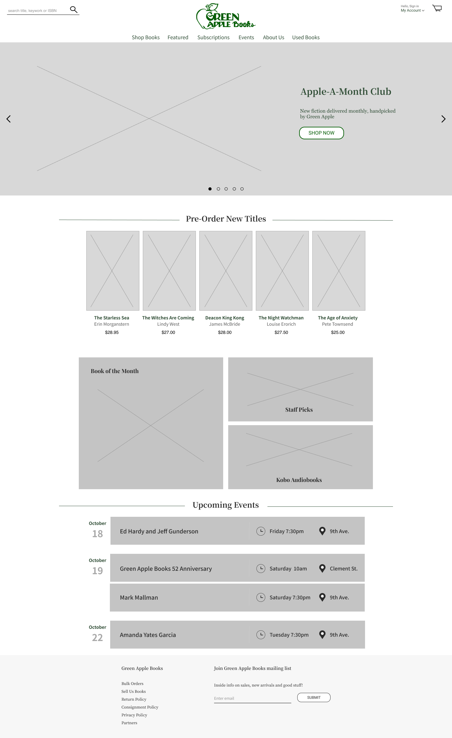
Green Apple Books is a local San Francisco based bookstore that has held a special spot in the hearts of it's clientele for over 50 years. The business' website, however, is outdated and difficult to navigate as a user due to inconsistent positions for the shopping cart feature and long checkout process.
I revamped the existing site by altering the information architecture of the sites navigation, refreshing the dated design and providing consistency amongst different pages and features on the site.
2-week conceptual project through General Assembly
Lead UX designer - discovery, user research, design, animation, user testing
“As a customer since the age of 12 (now 60!) enchanted by the smell of books both old and new, I cannot recommend Green Apple Books highly enough … You just may find yourself!” - Lorraine Cathy, a devoted patron of Green Apple Books.
Reviews from in store clientele of Green Apple Books are consistently as positive as the comment above. The thoughtful staff and homey environment keep guests coming back year after year. But as the e-commerce landscape evolves with the rise of Amazon, it becomes vital for small businesses to stand out online and consistently provide exceptional user experiences at every click.
My goal was to capture the quirky spirit of Green Apple Books and translate it into a webpage that offers a smooth shopping experience with a unique yet functional design.
I ran usability tests with 6 volunteers from Toronto, ON. Selection process required users to be a regular online shopper, with at least one of these online purchases being for books. On the existing Green Apple Books site users were tasked with adding two specific items to their cart, without the use of the search bar, then proceeding to and completing checkout.
Feedback based on the original Green Apple Books webpage resulted in these findings:
As users navigate around the site, the shopping cart moves from one location to the next without ever establishing a fixed, and known position. 100% of users were left confused and asked for assistance.
Within the Browse Books tabs page, there existed 54 different categories in which users could search for books. This overload of information left users feeling overwhelmed with options and less likely to use the feature.
Long single paged shopping cart with inadequate checkpoints leave users unable to determine their position to purchase flow. Upon further questioning with users, 5/6 users said they were more likely to abandon purchase midway when the checkout process is unclear.
I began to develop the core user persona of the Busy Buyer, an age neutral archetype to prevent any unintentional biases. Within this archetype there exists two users groups:
Primary: Regular online shopper that frequents large competitor brands and has never been to a Green Apple Books store.
Secondary: Faithful patron of Green Apple Books, typically shops in store for their books rather than online.
With our users and their problems in mind, I developed the following question:
How might I create a webpage for Green Apple Books that that users can easily navigate, while providing the same local and eclectic feel online that shoppers experience in-store?
Based on user insights and persona needs, I defined these project goals to improve usability of the website and create a user-centric design foundation:
Create a hierarchy of information to reorganize the site structure in a meaningful way.
Create consistent design templates to help users locate key features like the shopping cart and improve visual design.
Break checkout into relevant parts to allow user to know their position in the flow
Method: Open card sorting
Goal: Understand users mental model and their prioritization
Open card sorting provided insight into how users would like to categorize content. With this information I adjusted terminology and refined the navigation hierarchy from 54 categories to 15.
The process began with pencil to paper then translated into digital form. These initial sketches and paper prototypes allowed for drafting, testing and redesign prior to creating digital wireframes. Varying versions of the global navigation and icons were created and subject to user interview to determine the most effective.
When altering the checkout flow I conducted user interviews to determine which method was preferred by users. Participant feedback established that 6/6 preferred a single page checkout with 3 dropdown buckets rather than a multipage flow.
There was no determined style guide for Green Apple Books therefore I created my own colour palette, typography, icons, grid and buttons.
The grid is 12-columns, each with the width 74px and gutter of 16px
The majority of this project was completed in Sketch but as a result of my subscription ending, in the last few days I moved to Figma. Getting a grasp of the new terminology and workings of a software did waste some valuable project time.
Getting feedback from my design supervisor and users allowed me to tailor my ideas, sketches, and wireframes at each step of the design process.
As a conceptual project through General Assembly, I was not in contact with stakeholders or provided funding. I learnt to conduct user interviews and usability without any expensive tools.